First upload the dataset in the Google Colab Notebook
Python Libraries Import
 |
From Colab Notebook
|
Explanation:
This code imports several libraries that are commonly used
for data analysis and visualization.
NumPy is a library for working with
arrays and matrices of numerical data. It provides functions for mathematical
operations on arrays, including linear algebra and Fourier transforms. pandas
is a library for working with data in a tabular format. It provides data
structures and functions for manipulating and analyzing data in a way that is
similar to working with data in a spreadsheet. matplotlib is a library for
creating static, animated, and interactive visualizations in Python. seaborn is
a library built on top of matplotlib that provides a higher-level interface for
creating statistical visualizations. In this code, NumPy and pandas are
imported using the standard import statement, while matplotlib.pyplot and
seaborn are imported using the import statement with an alias(plt and sns). This
code imports several libraries that are commonly used for data analysis and
visualization.
- numpy
is a library for working with arrays and matrices of numerical data. It
provides functions for mathematical operations on arrays, including linear
algebra and Fourier transforms.
- pandas
is a library for working with data in a tabular format. It provides data
structures and functions for manipulating and analyzing data in a way that
is similar to working with data in a spreadsheet.
- matplotlib
is a library for creating static, animated, and interactive visualizations
in Python.
- seaborn
is a library built on top of matplotlib that provides a
higher-level interface for creating statistical visualizations.
In this code, numpy and pandas are imported
using the standard import statement, while matplotlib.pyplot and seaborn
are imported using the import statement with an alias(plt and sns).
This makes it so that you can call the functions of these libraries by
prefixing them with the alias, e.g. plt.plot() instead of matplotlib.pyplot.plot().
The command %matplotlib inline makes sure that the
visualizations generated by matplotlib are displayed in the output cells of the
notebook, instead of opening in a separate window.
sns.set_style('darkgrid') sets seaborn's default
plotting style to 'darkgrid' which is basically a dark background grid.
sns.set(font_scale=1.5) sets the font size of the text used in the
plots to 1.5 times the default size. You can call the functions of these
libraries by prefixing them with the alias, e.g. plt.plot() instead of
matplotlib.pyplot.plot(). The command %matplotlib inline makes sure that the
visualizations generated by matplotlib are displayed in the output cells of the
notebook, instead of opening in a separate window. sns.set_style('darkgrid')
sets seaborn's default plotting style to 'darkgrid' which is basically a dark
background grid. sns.set(font_scale=1.5) sets the font size of the text used in
the plots to 1.5 times the default size.
Explanation:
This code reads in a CSV file called
"driverresponse.csv" using the pandas library, and then displays the
first five rows of the dataframe using the .head() method. The resulting output
will be the first five rows of the dataframe, with each row representing a
record and each column representing a field within that record.
Result:
Explanation:
df.shape is an attribute of a DataFrame (df) in the pandas library in Python. It returns a tuple representing the dimensions of the DataFrame, where the first element of the tuple is the number of rows and the second element is the number of columns.
For example, if a DataFrame df has 5 rows and 3 columns, the output of df.shape would be (5, 3).
This attribute is useful when working with large data sets and one wants to know the size of the dataframe without having to manually count the rows and columns.
Result:
Code:
Explanation:
df.info() is a method used in the Python programming
language to display information about a pandas DataFrame. When called, it
provides a summary of the DataFrame's columns, including the number of non-null
entries, the data type of each column, and the amount of memory used to store
the DataFrame. Additionally, it also displays the number of rows and columns in
the DataFrame.
Result:
Code:
Explanation:
df.isnull().any() is a method used in the Python
programming language to check if there are any missing or null values in a
pandas DataFrame. It returns a Boolean series indicating whether each column of
the DataFrame has at least one missing or null value.
The df.isnull() returns a dataframe of
the same shape as the original dataframe but with True wherever there is a null
value. The .any() method then checks if there is any True in each column
and returns a boolean series.
Result:
Code:
Explanation:
In this code snippet, df1 is assigned the result of
the df.drop(columns=['index',"sno","regionid"])
method. The drop() method is used to remove specified labels from rows
or columns of a DataFrame. In this case, the columns parameter is being
used to specify that columns with labels 'index', 'sno', and 'regionid' should
be removed from the original DataFrame (df) and the result is assigned
to a new DataFrame df1. The original DataFrame df is not
modified.
In short, the code is creating a new DataFrame df1
with the same data as df but without the columns 'index', 'sno' and
'regionid'.
Result:
Code:
Explanation:
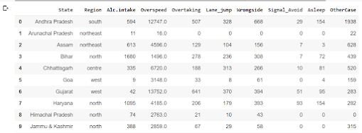
The code is creating a new dataframe called: "df2014" that is a copy of a subset of columns from an existing
dataframe called "df". The subset of columns that is being copied are: "stateut", "region",
"alcintake2014", "overspeed2014","overtaking2014", "lanejumping2014","wrongside2014",
"signalavoid2014", "asleep2014",and "othercause2014". The '.copy()' function is used to create a completely separate copy of the data, so changes made to "df201 will not affect the original data in "df".
Result:
Code:
Explanation:
This code renames the columns of a DataFrame called:
"df2014" using the rename() method. The columns
parameter is passed a dictionary where the keys are the original column names
and the values are the new column names.The original column names 'stateut', 'region', 'alcintake2014', 'overspeed2014', 'overtaking2014',
'lanejumping2014',
'wrongside2014', 'signalavoid2014', 'asleep2014' and 'othercause2014' are being replaced with the new
column names 'State', 'Region', 'Alc.intake', 'Overspeed', 'Overtaking', 'Lane_jump', 'Wrongside',
'Signal_Avoid', 'Asleep' and 'OtherCase' respectively.
At the end of the code df2014 is being called which is returning the dataframe after modification.
Result:
Code:
Explanation:
This code adds a new column called "Total_Accident" to the DataFrame "df2014". The values in
this new column are calculated by adding the values of several other columns of the DataFrame.
'Lane_jump', 'Wrongside',
'Signal_Avoid', 'Asleep' and 'OtherCase' respectively. This is done by using the
syntaxdf2014['Total_Accident']=df2014['Alc.intake']+df2014['Overspeed']+df2014['Overtaking']
+df2014['Lane_jump']+df2014['Wrongside']+df2014['Signal_Avoid']+df2014['Asleep']+df2014['OtherCase']
At the end of the code df2014 is being called which is returning the dataframe after modification.
Explanation:
This code sorts the DataFrame "df2014" by the values in the column "Total_Accident"
in descending order, and assigns the sorted DataFrame to a new variable "ACC". The sort_values()
method is used to sort the DataFrame by a specific column, in this case "Total_Accident".
The ascending parameter is set to False, so that the DataFrame is sorted in descending order. The axis parameter is set to 0, which means the sorting is done along the rows, not the columns.
At the end of the code ACC is being called which is returning the dataframe after sorting.
Result:
Explanation:
This code is using the pandas library in Python to group a dataframe (ACC) by the column 'Region' and then summing the values in thecolumn 'Total_Accident' for each group. The resulting dataframe is then sortedin descending order based on the values in the 'Total_Accident' column. The final dataframe is assigned to the variable "df14".
Code:
Explanation:
This code is using the "plot" method of the pandas library to create a bar chart from the dataframe "df14",
with thevalues in the "Total_Accident" column on the y-axis. The parameter "kind" is set to "bar" to
specify that a bar chart should be created. The parameter "legend" is set to "False" to hide the legend.
The parameter "color" is set to "red" to specify the color of the bars. The parameter "figsize" is set to(12,8) to specify the width and height of the chart.After that, The code use plt (matplotlib library) to add the title, xlabel, ylabel, legend and grid to the
"plt.gca().yaxis.grid(linestyle='--')" adds the grid lines on y-axis with style '--'.
graph. "plt.ylabel('Total_Accident')" adds label 'Total_Accident' on y-axis,"plt.xlabel("Region")" adds label 'Region' on x-axis,"plt.title("Accident by Region")" adds title 'Accident by
Region' on top of the graph, "plt.legend()" adds the legend on the graph,
Code:
Explanation:
This is a piece of code that is manipulating a dataframe in the programming language Python.
The code starts by creating a new dataframe,"df14s", which is a subset of another dataframe, "df2014".
The subset is created by selecting only the columns "Region", "State", and "Total_Accident" from the
original dataframe. Next, the code uses the ".groupby()" method to group the rows of "df14s" by the
values in the "Region" and "State" columns. The ".sum()" method is then applied to the grouped data,
which calculates the sum of the "Total_Accident" column for each group.Finally, the ".sort_values()" method is used to sort the grouped and summed data by the "Total_Accident"column, in descending order (ascending=False). The result is a new dataframe that is sorted by the total number of accidents in each region and state.
Result:
Code:
Explanation:
This code is using the Pandas library in Python tomanipulate a DataFrame (df14s) by grouping the data
by the "State" column and summing the "Total_Accident" column for each state. Theresult is then
sorted in descending order by the "Total_Accident" column. The final result is assigned to a new
DataFrame variable called "df14a".
Code:
Explanation:
This code is using the plot method of a pandas DataFrame (df14a) to create a bar chart. The y-axis of the chart will display the values of the 'Total_Accident' column in the DataFrame. The kind of plot is specified as 'bar'. The 'legend' parameter is set to 'False', so the chart will not display a legend. The color of the bars is set to 'red' using the 'color' parameter. The size of the chart is set to (16,10) using the 'figsize' parameter. The y-label is set to 'Total_Accident', the x-label is set to 'State' and the title is set to "Accident by States". The legend is displayed. The y-axis grid is set to '--' using plt.gca().yaxis.grid(linestyle='--').
Code:
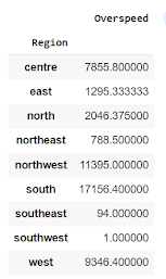
This is a piece of code written in the Python programming language using the Pandas library. It creates a pivot table from a dataframe (named "ACC" in this case) with the "Region" column as the index, and the "Overspeed" column as the values.In other words, it groups the data by the "Region" column and then calculates the aggregate of "Overspeed" column for each group. Pivot table is used to summarize and aggregate large data sets. It reshapes dataframe by providing a new, organized view of data.
Code:
This code uses the pandas library to create a pivot table of the data in the variable "ACC" with the Region as the index and the values being the "Overspeed" column. It then plots this pivot table as a horizontal bar chart using the .plot() method and specifies the chart type as 'barh'. The plt.show() command is then used to display the chart.
Result:
Code:
Explanation:
This is a piece of code that creates a pivot table from a DataFrame (named "ACC" in this case) using the Pandas library. The pivot_table() function is used to summarize and aggregate data in the DataFrame.
The pivot table will be created by:
Using the "Region" column as the index of the pivot table, which means the data will be grouped by the unique values in the "Region" column
Using the columns "Overspeed","Alc.intake","Overtaking" as the values of the pivot table, which means some aggregate values will be calculated for each group of the "Region" column.
Using the aggregate functions mean, median and std from numpy library to calculate the statistics for each values columns.
The pivot table can be visualized as a new table, with the unique values of the "Region" column as the rows, and the calculated aggregate values of the columns "Overspeed", "Alc.intake", "Overtaking" as the columns, with each column having 3 sub columns with statistics mean, median and std .
Result:
Code:
Explanation:
This code snippet is using the Python library Pandas to create a pivot table of data from a DataFrame called "ACC" that has a column called "Total_Accident". The pivot table groups the data by the "Region" column and applies the aggregation functions "np.mean" and "remove_outliers" to the "Total_Accident" column.
The function "remove_outliers" is defined to take in a single argument "values", which is assumed to be a Pandas series. It first calculates the interquartile range (0.25 and 0.75 quantiles) of the input values using the ".quantile()" method, and then returns the mean of these two values using the "np.mean()" function. This will return the median of the input values.
In summary, the code is creating a pivot table that groups the data by "Region" and calculates the mean of "Total_Accident" and median of "Total_Accident" after removing the outliers.
Result:
Code:
Explanation:
This code snippet is using the Python library Pandas to generate a summary statistics of a DataFrame called "df2014".
The ".describe()" method is used to get the summary statistics of all the numeric columns in the DataFrame. The method returns a new DataFrame with the following statistics: count, mean, standard deviation, minimum, 25th percentile, median (50th percentile), 75th percentile, and maximum.
The ".round()" function is used to round the values in the DataFrame to the nearest whole number. This is useful if the values in the DataFrame are floating-point numbers and you want to display them in a more human-readable format.
In summary, this code snippet generates a summary statistics of all the numeric columns in the DataFrame "df2014" and rounds the values to the nearest whole number.
Result:
Code:
Explanation:
"ACC" likely refers to a dataframe or table that contains information about accidents. The command is asking for the correlation between the variables "Alc.intake" (alcohol intake) and "Overspeed" within that table. The .corr() function calculates the correlation between these two variables, which can range from -1 (perfect negative correlation) to 1 (perfect positive correlation). This would give a numerical value which can tell us how much these two variables are related.
Result:
Code:
Explanation:
"plt.figure(figsize=(14,8))" creates a new figure with a width of 14 inches and a height of 8 inches. "sns.regplot(data=ACC, x='Alc.intake', y='Overspeed')" is a function from the seaborn library (sns) for creating a scatter plot with a regression line. It plots the data from the 'ACC' dataframe with the variable 'Alc.intake' on the x-axis and 'Overspeed' on the y-axis. The regplot() function also fits a linear regression model to the data and plots the regression line. This line represents the best fit of the data and can give us insight on the relationship between the two variables.
Result:
Code:
Explanation:
"plt.figure(figsize=(16,10))" creates a new figure with a width of 16 inches and a height of 10 inches. "sns.boxplot(data=ACC[['Alc.intake', 'Overspeed', 'Overtaking', 'Lane_jump', 'Wrongside', 'Signal_Avoid', 'Asleep', 'OtherCase']])" creates a boxplot using seaborn library. A boxplot, also known as a whisker plot, is a standardized way of displaying the distribution of data based on five number summary ("minimum", first quartile (Q1), median, third quartile (Q3), and "maximum"). This command is creating boxplot with data from ACC dataframe, considering multiple columns ['Alc.intake', 'Overspeed', 'Overtaking', 'Lane_jump', 'Wrongside', 'Signal_Avoid', 'Asleep', 'OtherCase']. This will give us an idea of the distribution of these columns visually and also allows us to identify any outliers in the data.
The boxplot provides a clear picture of how the values in the data are spread out. The box in the middle of the plot represents the interquartile range (IQR), which is defined as the difference between the first and third quartiles (Q1 and Q3). The line in the middle of the box represents the median value. The "whiskers" extending from the box show the range of the data (by default, this is defined as 1.5 times the IQR). Any data points outside this range are considered outliers and are plotted as individual points.
Result:
Code:
Explanation:
This code creates a violin plot using the Seaborn library (sns) to display the distribution of a variable (Overspeed) by a categorical variable (Region) in a DataFrame (ACC). The plot size is set to 14 inches in width and 6 inches in height using the plt.figure(figsize=(14,6)) function. The palette parameter is set to type_colors, which specifies the colors to use for the different categories in the Region variable.
Result:
Code:
Explanation:
This code creates a histogram plot using the Seaborn library (sns) to display the distribution of a variable (Alc.intake) in a DataFrame (ACC). The plot size is set to 14 inches in width and 10 inches in height using the plt.figure(figsize=(14,10)) function. The kde parameter is set to True, which causes a kernel density estimate (KDE) line to be plotted on top of the histogram, providing a smooth estimate of the probability density function of the underlying variable.
Result:
Code:
Explanation:
This code is creating a correlation matrix for a DataFrame called ACC, which has columns for various factors that may contribute to accidents, such as alcohol intake, overspeeding, and lane jumping. The corr() function is used to calculate the correlation coefficients between all pairs of columns in the DataFrame.
The code then creates a heatmap visualization using the Seaborn library's heatmap() function. The heatmap() function takes the correlation matrix as an input and sets the x-axis and y-axis tick labels to be the column names. It also sets the color map to be 'YlGnBu' which is a color palette. The size of the figure is set to 13 inches by 10 inches using the subplots() function.
Result:
Code:
Explanation:
This code is using the Seaborn library's pairplot() function to create a scatter plot matrix of the columns in the DataFrame ACC. The pairplot() function creates a grid of scatter plots, where the diagonal plots are histograms of each variable. The input for the function is a subset of the ACC DataFrame that includes the columns 'Alc.intake', 'Overspeed', 'Overtaking', 'Lane_jump', 'Wrongside', 'Signal_Avoid', 'Asleep', 'OtherCase'. This will create a scatterplot matrix of these columns, showing the relationship between each pair of columns.
Result:
Find the workings in the following link:


Comments
Post a Comment